EXCLUSIVE: A first look at the Martine’s renovation
Thoughtful touches and bold elements are the hallmarks of the update.
A streamlined appearance While Martines’s layout remains the same, its new look is as fresh as its babkas and macarons.
BY DEBORAH SKOLNIK
Visitors to the Village were greeted with a welcome sight today: Martine’s, the bakery that launched a thousand guilt trips, is back up and running. When the shop didn’t open by last Friday as promised, it was hard not feel the slight panic and shakiness that mark the onset of DSS (donut deprivation syndrome). Luckily, however, the delay was seemingly minor.
Light touches
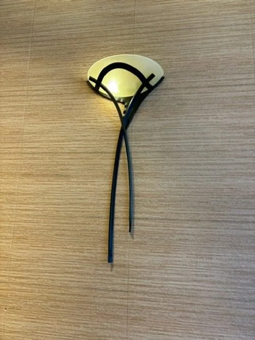
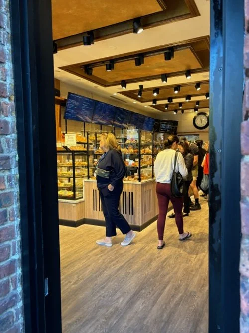
Gone are the bakery’s elaborate chandeliers, including the iconic one in the window. Instead, track lighting is affixed to the ceiling coffers, providing more uniform brightness. The sconces on the walls are elegant without being fussy, suggestive of a 21st-century update on the Art Deco of old.
Right on track Track lights have taken the place of the former chandeliers, providing better and more adjustable brightness.
Same scones, new sconces The wall lights have an upscale feel without being gaudy.
Counter intuitive
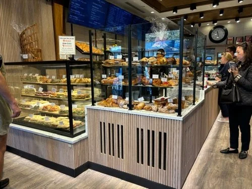
The old rounded, tiled counter, a look that was popular through the 2010s, has received a facelift. Crafted from reeded wood in a natural hue, its corners are now sharply defined.
Wood works New wooden panels add a textural element to the store.
Simply floored
In keeping with the overall lighter look, the floor of Martine’s is now a natural hue rather than a sporting a stain.
Walk this way A natural floor lends a more casual feel.
It’s hard to remember what the old Martine’s looked like—especially if you’re typically more focused on the funfetti cupcakes behind the glass. Here’s a reminder.
The Martine’s of yeast-erday. The darker hues and weighty chandeliers are now only memories.
What do you think of the reno? Leave your thoughts in comments below.


